general_bar_plot#
General bar plot comparing multiple metrics for each category with consistent colors and hatching.
📥 Arguments#
Name |
Type |
Required |
Description |
|---|---|---|---|
df |
pd.DataFrame |
✅ |
DataFrame containing the category column and one or more metric columns. |
category_column |
str |
✅ |
Column name for the x-axis categories (e.g., ‘Group’, ‘Condition’). |
figsize |
tuple |
❌ |
Figure size. Default: (12, 7). |
xlabel |
str |
❌ |
Label for x-axis. |
ylabel |
str |
❌ |
Label for y-axis. |
title |
str |
❌ |
Title of the plot. |
legend_loc |
str |
❌ |
Legend location. Default: ‘upper right’. |
bar_width |
float |
❌ |
Width of bars. Default: 0.25. |
color_map |
Dict[str, str] |
❌ |
Map from metric name to color. |
style_map |
Dict[str, str] |
❌ |
Map from metric name to hatch style. |
save |
str |
❌ |
Base filename to save PNG and PDF. |
📦 Example Output#
Click to show example code
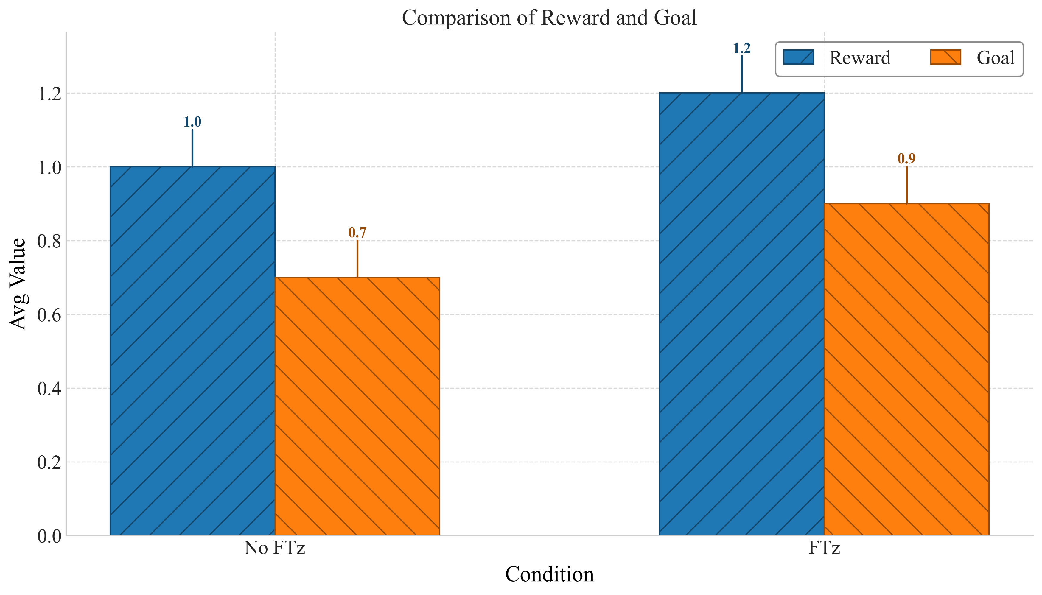
import pandas as pd
from swizz import plot
import matplotlib.pyplot as plt

df = pd.DataFrame({
    "Condition": ["No FTz", "FTz"],
    "Reward": [1.0, 1.2],
    "Goal": [0.7, 0.9],
})

fig, ax = plot("general_bar_plot",
    df=df,
    category_column="Condition",
    ylabel="Avg Value",
    title="Comparison of Reward and Goal",
    color_map={"Reward": "tab:blue", "Goal": "tab:orange"},
    style_map={"Reward": "/", "Goal": "\\"},
    bar_width=0.3,
    save="general_bar_plot"
)
plt.show()