percentile_curve_plot#
Plot a curve showing scores ranked by percentile, with optional normalization, vertical/horizontal marker lines, and shaded regions for top scores.
📥 Arguments#
Name |
Type |
Required |
Description |
|---|---|---|---|
scores |
Union[pd.Series, pd.DataFrame] |
✅ |
Scores as a pandas Series or DataFrame. If DataFrame, use single-column or specify column. |
column |
str |
❌ |
Column name to use if |
normalize_scores |
bool |
❌ |
Whether to normalize scores between 0 and 1. Default: True. |
normalize_percentiles |
bool |
❌ |
Whether to normalize x-axis (percentile) between 0 and 1. Default: True. |
horizontal_markers |
List[Tuple[float, str]] |
❌ |
List of (y_value, label) for horizontal reference lines. |
vertical_markers |
List[Tuple[float, str]] |
❌ |
List of (x_value, label) for vertical reference lines. |
highlight_top_n |
int |
❌ |
Number of top scores to highlight with background shading. Default: None. |
highlight_color |
str |
❌ |
Background color for the highlight region. Default: light green. |
highlight_label |
str |
❌ |
Optional label to display inside the highlight area. Default: None. |
highlight_label_color |
str |
❌ |
Color for the highlight label text. Default: ‘green’. |
highlight_label_font_size |
int |
❌ |
Font size for the highlight label text. Default: same as font_axis. |
vertical_label_offset |
float |
❌ |
Vertical offset above vertical marker in axis coordinates. Default: 0.02. |
xlabel |
str |
❌ |
Label for the x-axis. Default: ‘Percentile’. |
ylabel |
str |
❌ |
Label for the y-axis. Default: ‘Score’. |
title |
str |
❌ |
Title for the plot. Default: None. |
font_family |
str |
❌ |
Font family for text. Default: ‘Times New Roman’. |
font_axis |
int |
❌ |
Font size for axis labels. Default: 14. |
figsize |
tuple |
❌ |
Figure size in inches. Default: (8, 5). |
save |
str |
❌ |
Base filename to save PNG and PDF if provided. |
📦 Example Output#
Click to show example code
import pandas as pd
import numpy as np
import matplotlib.pyplot as plt
from swizz import plot
# Generate fake scores as a pandas Series
np.random.seed(42)
scores = pd.Series(np.random.normal(200, 400, size=500), name="score")
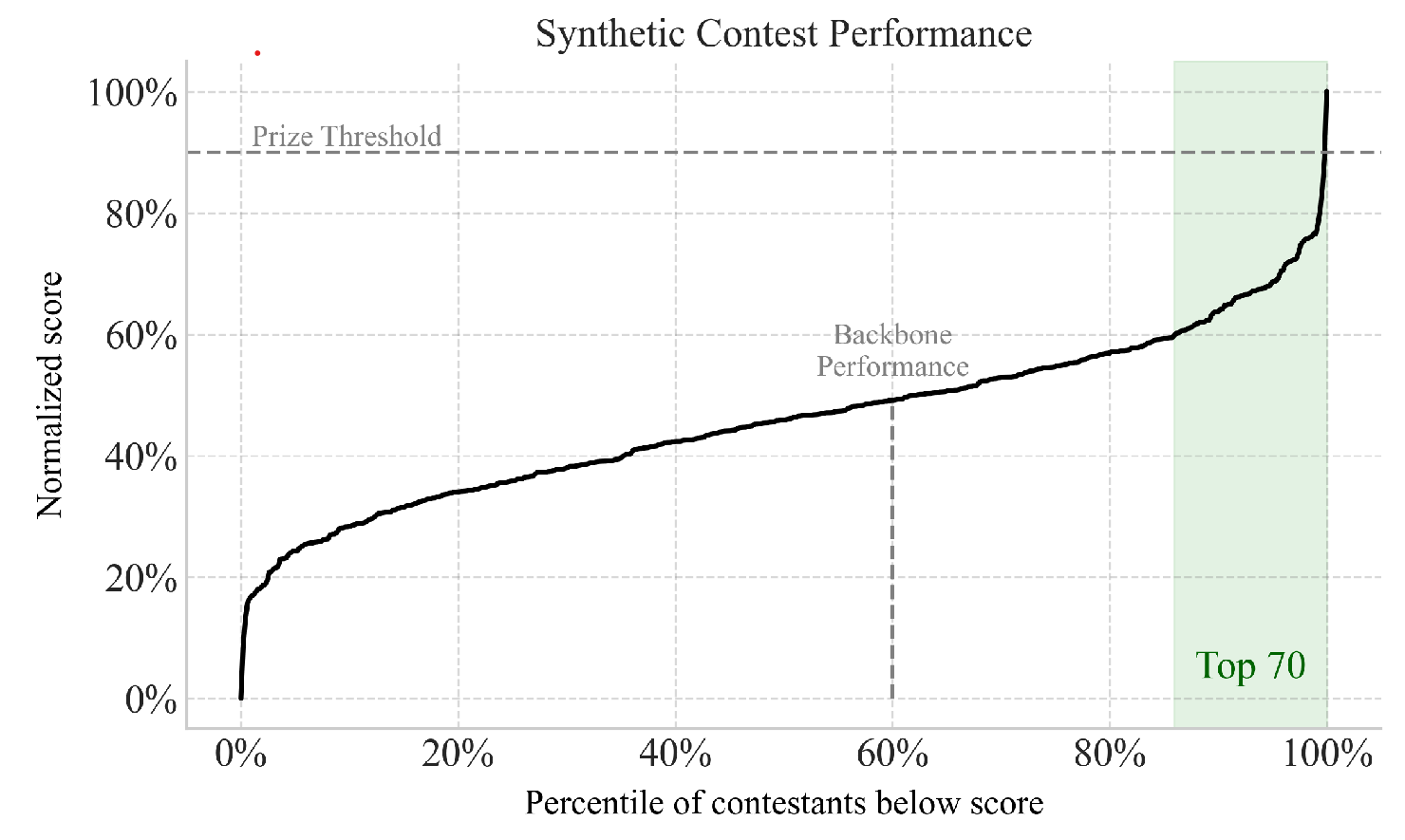
fig, ax = plot("percentile_curve_plot",
scores=scores,
normalize_scores=True,
normalize_percentiles=True,
horizontal_markers=[
(0.9, "Prize Threshold"),
],
vertical_markers=[
(0.6, "Backbone\nPerformance"),
],
highlight_top_n=70,
highlight_label="Top 70",
highlight_label_color="darkgreen",
highlight_label_font_size=16,
highlight_color="#c8e6c9",
vertical_label_offset=0.03,
xlabel="Percentile of contestants below score",
ylabel="Normalized score",
title="Synthetic Contest Performance",
font_family="Times New Roman",
font_axis=14,
figsize=(8, 5),
)
plt.show()